knitr::opts_chunk$set(echo = TRUE)

library(dplyr) #package with useful data manipulation functions
library(ggplot2) #package allowing us to make plots
library(palmerpenguins) #package containing our dataWeek 5: Data Visualization Part 3
In this lab, we will cover best practices in data visualization and learn how to fine tune and modify basic visualizations in R using ggplot2
A COUPLE IMPORTANT NOTES:
Click “Run Code”
You will receive some warning outputs in this tutorial related to NAs in the data set. Don’t worry about that for right now.
The code chunk below sets up our coding environment. You will see I use the library() function to call packages. Packages are add ons you can load into R that include specialized functions. For example, ggplot2 is a package with functions that give us a lot of flexibility in creating data visualizations.
For this tutorial we will be working with the Palmer Penguins data set again. As a reminder, this data set includes morphometric information on three different species of penguins across three different islands in Antarctica monitored by the Palmer Station Long Term Ecological Research study area. These data were made available by Dr. Kristen Gorman and were originally published in:
Gorman KB, Williams TD, Fraser WR (2014). Ecological sexual dimorphism and environmental variability within a community of Antarctic penguins (genus Pygoscelis). PLoS ONE 9(3):e90081. https://doi.org/10.1371/journal.pone.0090081
Meet the penguins!
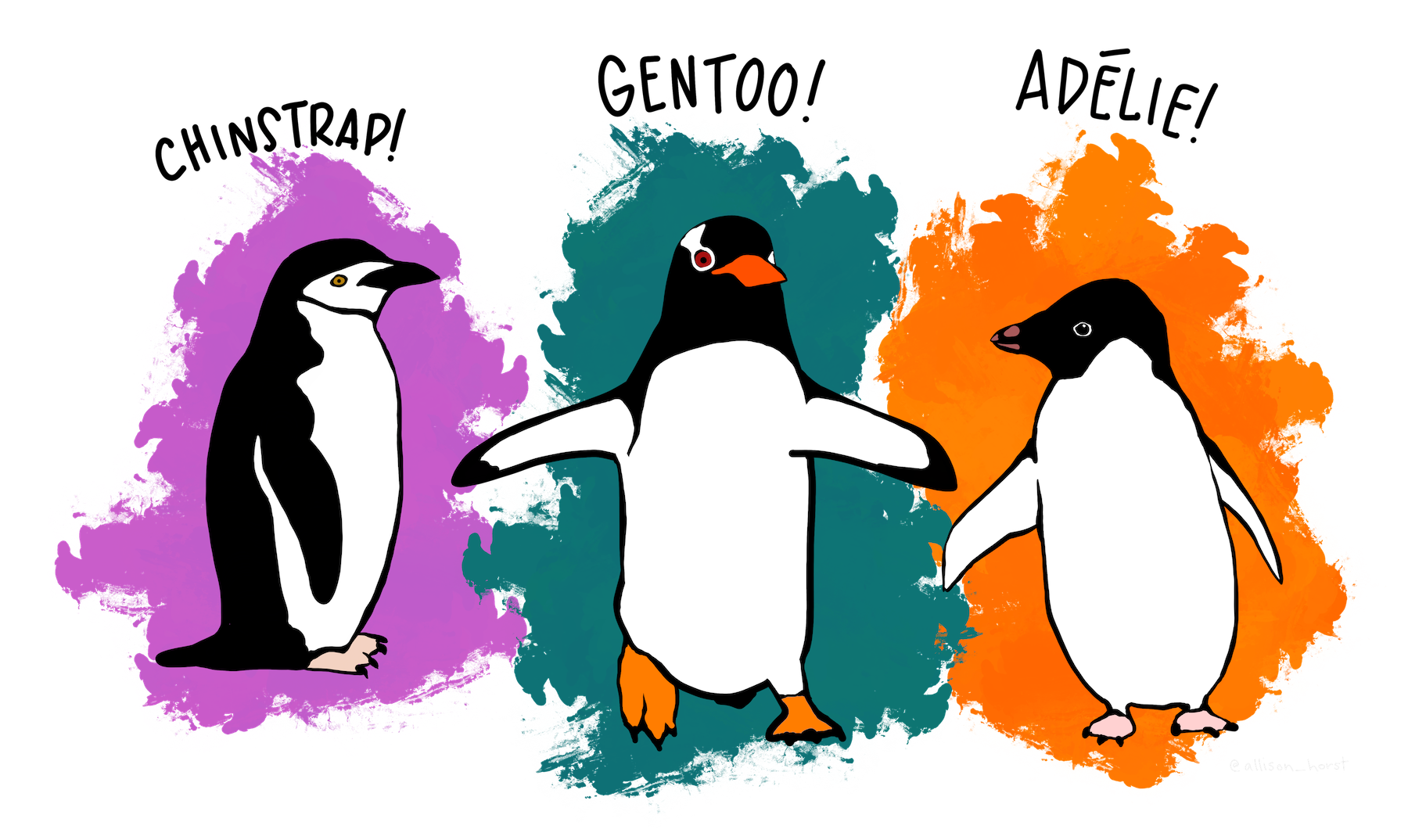
Palmer penguin species (artwork by @allison_horst).
Use the code chunk below to load and take a quick look at our data set.
Not all data visualizations are created equal
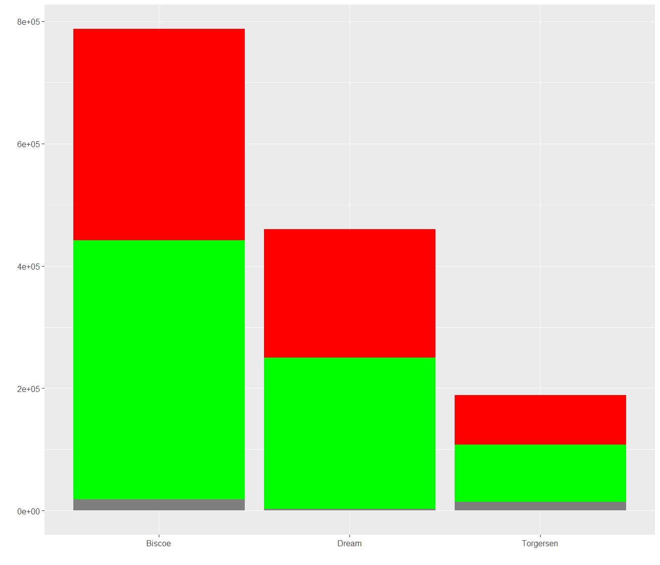
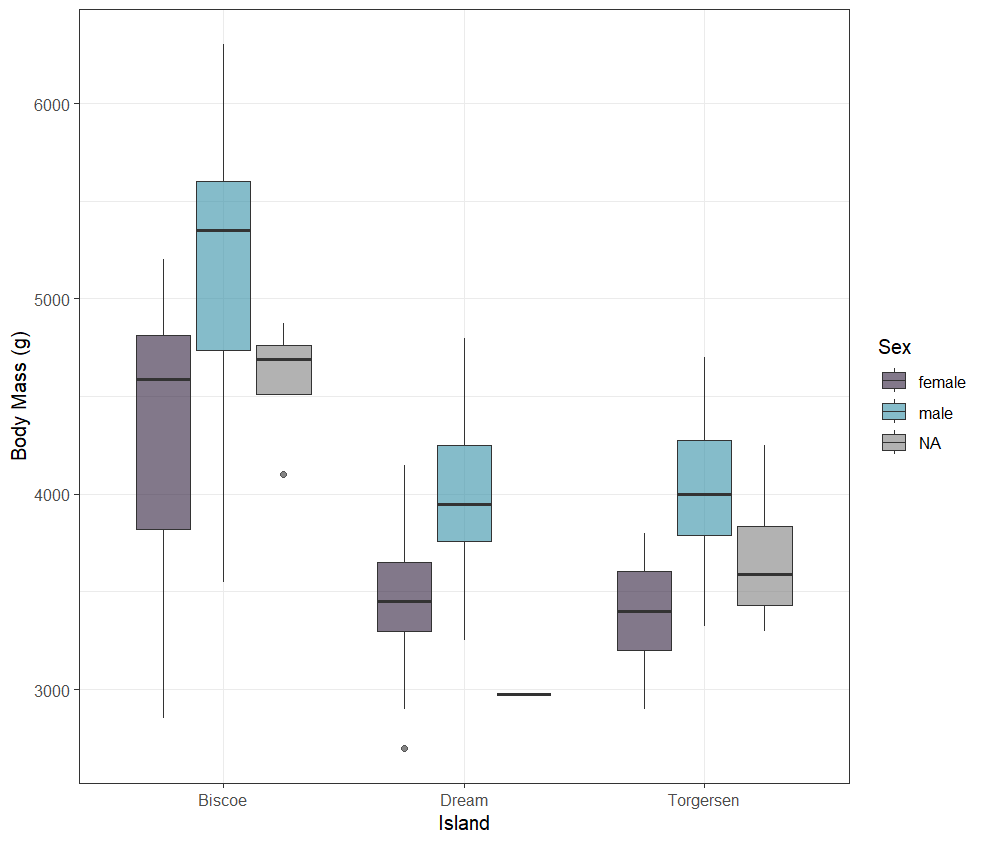
Take a look at Figures 1 and 2 below. Both were made using the same data from the Palmer Penguins dataset. Which visualization is easier to interpret? Why?
Analysis Interlude
Answer the following questions in the code chunk below, or directly in your homework template.
What information can you gain from looking at each plot?
Which do you think is a better visualization? Why?
In Figure 2, if you had to classify the outlier of unknown sex from Biscoe Island as male or female,, which sex would you choose? Why?
Best practices in data visualization
In this section we will go over some guidelines for creating effective visualizations from data.
Visualizations should serve a purpose.
You should start your data visualization process by asking yourself, “what do I want people to take away from this visualization?” Tailor your visualization to achieving your specified purpose, and return to that question often during the process to ensure that you are meeting your original objective.For example, in Figures 1 and 2, if our objective was to highlight the difference in body mass between male and female penguins from different islands, having the core visualization side by side for each island like in Figure 2 is much more effective than stacking them like in Figure 1.
Know your audience.
Related to understanding the purpose of your visualization, you should also understand the audience you are creating it for. Is it intended to be used by the public? Scientists? Corporate clients for your data science business? You would prioritize different elements for each of these audiences. It is important to take time to conciously identify your audience and evaluate the effectiveness of visualization for your target audience throughout the process.Choose the right visualization for the job.
There are a number of different visualization types, and which one you choose depends on what your goals are. There are online tools that can help you decide which chart type is the most effective for your goals. Here are a few examples:Figures 1 and 2 provide a good example of how choosing the right type of visualization can have a strong impact.
Simplify and focus.
More often than not a simpler visualization will be better than a more complex one. You should evaluate your visualizations critically and remove any unnecessary elements to draw attention to those that are most important for achieving your purpose. Using predictable patterns for layouts and maintaining a common theme can help with this if you have multiple visualizations for one project.Use color effectively.
Bad color choices can ruin a visualization. Use colors to highlight important elements and maintain consistency. Avoid using excessively bright or clashing colors. This is also an important area for ensuring accessibility. Color blindness is a common enough condition that you should take it into consideration when selecting colors for your visualizations.Provide necessary context
Your audience should be able to understand exactly what your visualization is showing, meaning you need to give them all the necessary information. This can come in the form of axis labels, legends, and sometimes a caption. You might also add elements to draw attention to the most important points, such as baselines or benchmarks.
Let’s visualize some data!
In this section we will work on improving visualizations using ggplot2.
For this first example, each line of code includes a comment (denoted by #) that describes what that line is doing. In general, it’s good practice to go line by line in code you receive to ensure you fully understand what it’s doing.
In the exercise code chunks, you will be required to fill in the missing code (denoted by #FILLMEIN) to create the visualization.
Demonstration 1:
We are going to start by improving the plot we made in the first tutorial showing the relationship between flipper length and body mass by species by adjusting the color and style.
This isn’t a bad visualization, but we might want to relabel the axes and legend to make them more clear and aesthetically pleasing. We might also want to change the colors of the points and remove the gray from the plotting area to simplify things.
In the following code chunk, I have only included comments on the parts of the code that have changed from above.
Exercise 1:
Adjust the code chunk below to create a visualization that shows the same data as above but with a different style and color palette. Spend some time exploring the different built-in options ggplot2 has for controlling these elements.
HINT: Check out ggplot2’s pre-loaded themes and try Googling “hex color picker” to find the codes for different colors.
TAKE A SCREENSHOT OF THE CODE/RESULTING PLOT AND PUT IT IN YOUR HW DOCUMENT.
Demonstration 2:
In the above visualization we were plotting two continuous or numerical variables, meaning the values of the variables are actual numbers, and one categorical variable, meaning the values of the variable are levels of a category.
It is common to use the axes to display continuous variables and color to depict a categorical variable, as we did in the figure above, but it depends on what your goals are. When you want to emphasize the comparison of a single continuous variable across levels of a category, the categorical variable might become one of the axes, similar to what was done in Figure 1 and Figure 2 at the beginning of this tutorial.
In this section we will explore visualizations that are good for categorical variables.
Run the code chunk below to see an example of a visualization plotting a continuous variable (flipper_length_mm) against a categorical variable (sex) using a box plot.
Exercise 2:
Adjust the code chunk below to create a visualization that shows the same data as above but change the following elements:
type of plot (i.e. don’t do a box plot)
color the plotted elements based on sex
change the axis labels and legend title
set a different theme
HINT: For inspiration on types of plots ggplot2 has available for plotting a categorical (aka discrete) variable against a continuous variable, check out the ggplot2 cheat sheet here.
TAKE A SCREENSHOT OF THE CODE/RESULTING PLOT AND PUT IT IN YOUR HW DOCUMENT.
Demonstration 3:
In this section we will work on improving a visualization using the best practices listed above.
Our goal is to create a visualization for the general public that shows the difference in penguin species composition across islands. Imagine the plot is going to be used on an informational plaque in an aquarium.
This visualization is not very effective for a number of reasons… First off we can’t actually see the points, because they are stacked on top of each other. Aesthetically, it is incredibly boring and wouldn’t entice aquarium visitors to come take a closer look. If our goal is to dispense information about the number of different penguin species across the different islands, we have not done a very good job.
Exercise 3:
Adjust the code chunk below to improve the above visualization to better achieve our stated goal using the data visualization best practices as guidance.
HINT: For inspiration on types of plots ggplot2 has available for plotting categorical (aka discrete) variables, check out the ggplot2 cheat sheet here. Consider the option that you might want to plot a single categorical variable and use “fill” or “color” to distinguish your second categorical variable.
TAKE A SCREENSHOT OF THE CODE/RESULTING PLOT AND PUT IT IN YOUR HW DOCUMENT.
FINAL EXERCISE: Your turn!
For the final exercise you can create a visualization of your choosing, but you must explain how you addressed each of the data visualization best practices in your response. That means you must clearly define the purpose of your visual, who your audience is, and why you made the aesthetic decisions that you chose.
To receive full points, your figure must be accompanied by a written explanation for each best practice.
TAKE A SCREENSHOT OF THE CODE/RESULTING PLOT AND PUT IT IN YOUR HW DOCUMENT.
Citations and Helpful Links
This lab was created by Dr. Kayla Blincow for the University of the Virgin Islands Data Science program using ideas, information, and inspiration from the following sources:
Questions about implementing this tutorial? Contact Kayla Blincow at kaylamblincow@gmail.com.