knitr::opts_chunk$set(echo = TRUE)

library(tidyverse) #this call loads all tidyverse packages (including ggplot2)Week 4: Global Plastic Waste
This tutorial is a modified version Data Science in Box’s Lab 02 - Global plastic waste found here. All material and concepts should be attributed to the Data Science in a Box initiative.
The problem of plastic
Plastic pollution is a major and growing problem, negatively affecting oceans and wildlife health. Our World in Data has a lot of great data at various levels including globally, per country, and over time. For this lab we focus on data from 2010.
Additionally, National Geographic ran a data visualization communication contest on plastic waste as seen here.
Image: Mahamed Abdulraheem - Shutterstock.com
Plastic data
The code chunk below sets up our coding environment. You will see I use the library() function to call packages. Packages are add ons you can load into R that include specialized functions. By typing library(tidyverse) we are asking R to load all of the tidyverse packages, including ggplot2. We are also going to load in our global plastic waste data set from a .csv file stored on my computer using the read_csv() function.
That data set we have loaded has the following variable descriptions:
code: 3 Letter country codeentity: Country namecontinent: Continent nameyear: Yeargdp_per_cap: GDP per capita constant 2011 international $, rateplastic_waste_per_cap: Amount of plastic waste per capita in kg/daymismanaged_plastic_waste_per_cap: Amount of mismanaged plastic waste per capita in kg/daymismanaged_plastic_waste: Tonnes of mismanaged plastic wastecoastal_pop: Number of individuals living on/near coasttotal_pop: Total population according to Gapminder
What are some ways you can explore the data set we just loaded in the R environment? Type a couple things in the chunk below and screenshot the resulting code/output for your HW assignment.
Exercises
Let’s start by looking at the distribution of plastic waste per capita in 2010.
ggplot(data = plastic_waste, aes(x = plastic_waste_per_cap)) +
  geom_histogram(binwidth = 0.2)
Warning: Removed 51 rows containing non-finite outside the scale range
(`stat_bin()`).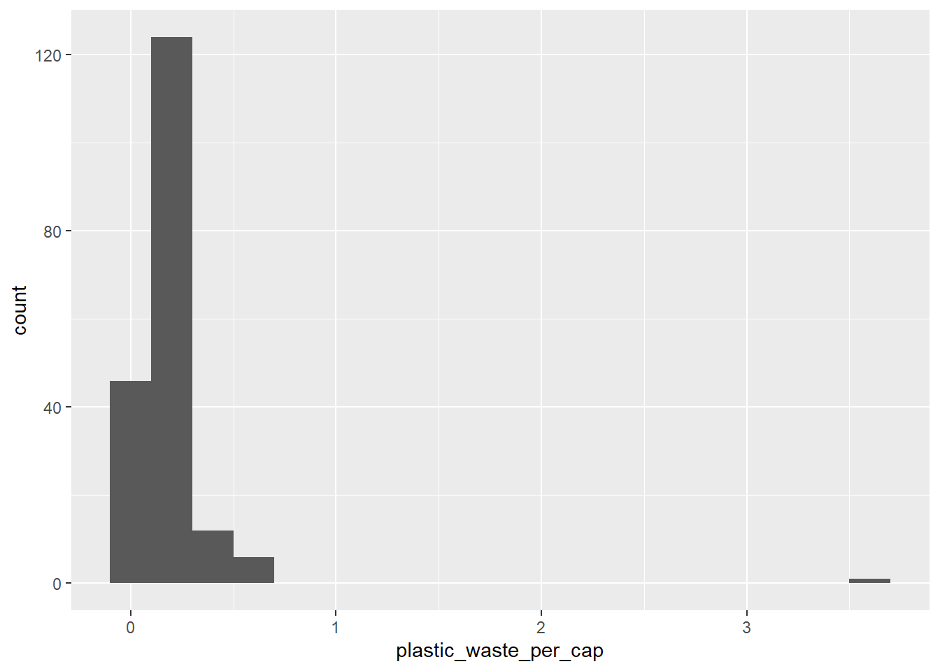
One country stands out as an unusual observation at the top of the distribution. One way of identifying this country is to filter the data for countries where plastic waste per capita is greater than 3.5 kg/person.
plastic_waste %>%
  filter(plastic_waste_per_cap > 3.5)
code entity continent year gdp_per_cap plastic_waste_per_cap
1 TTO Trinidad and Tobago North America 2010 31260.91 3.6
mismanaged_plastic_waste_per_cap mismanaged_plastic_waste coastal_pop
1 0.19 94066 1358433
total_pop
1 1341465Did you expect this result? You might consider doing some research on Trinidad and Tobago to see why plastic waste per capita is so high there, or whether this is a data error.
- Plot, using histograms, the distribution of plastic waste per capita faceted by continent. (HINT: You might want to revisit the Mine’s video from last week ;) )
- What can you say about how the continents compare to each other in terms of their plastic waste per capita?
Another way of visualizing numerical data is using density plots.
ggplot(data = plastic_waste, aes(x = plastic_waste_per_cap)) +
  geom_density()
Warning: Removed 51 rows containing non-finite outside the scale range
(`stat_density()`).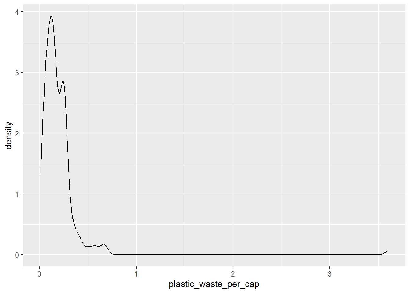
And compare distributions across continents by colouring density curves by continent.
ggplot(data = plastic_waste,
       mapping = aes(x = plastic_waste_per_cap,
                     color = continent)) +
  geom_density()
Warning: Removed 51 rows containing non-finite outside the scale range
(`stat_density()`).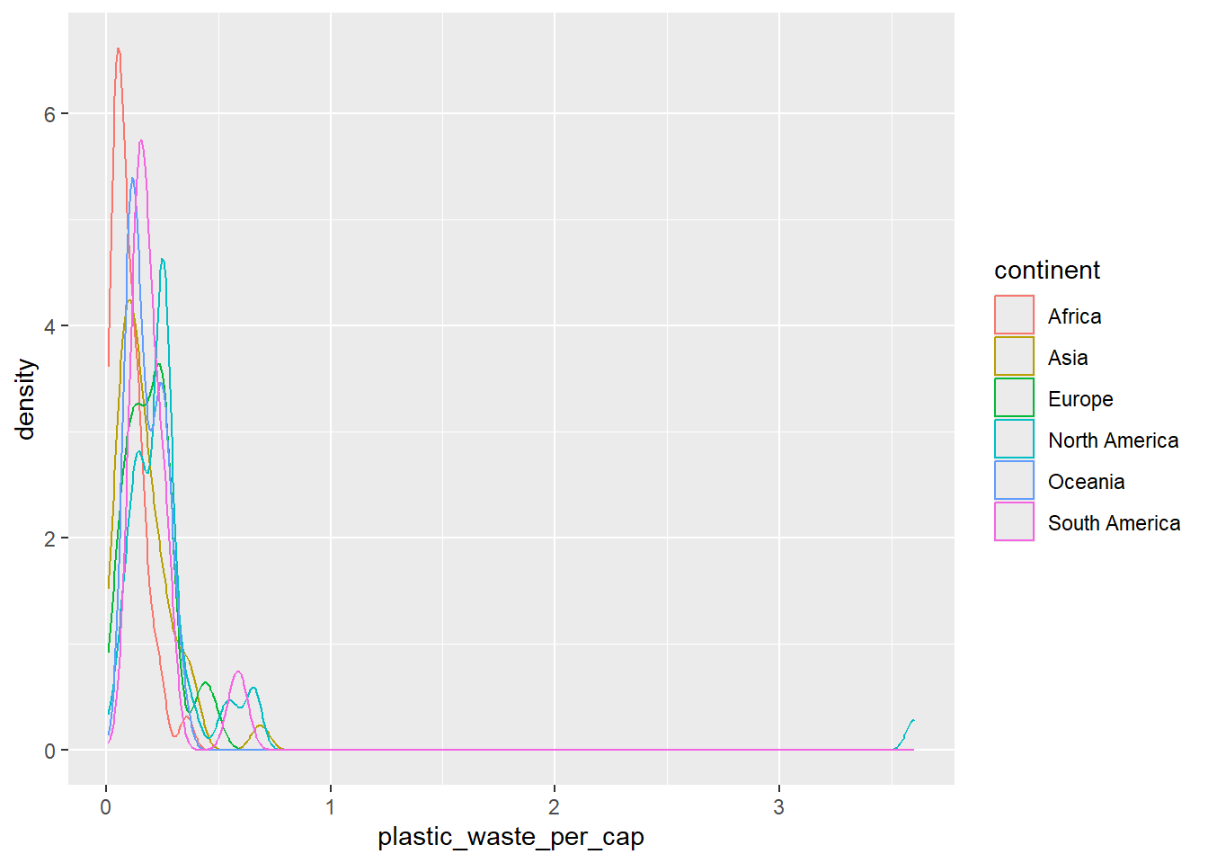
The resulting plot may be a little difficult to read, so let’s also fill the curves in with colours as well.
ggplot(data = plastic_waste,
       mapping = aes(x = plastic_waste_per_cap,
                     color = continent,
                     fill = continent)) +
  geom_density()
Warning: Removed 51 rows containing non-finite outside the scale range
(`stat_density()`).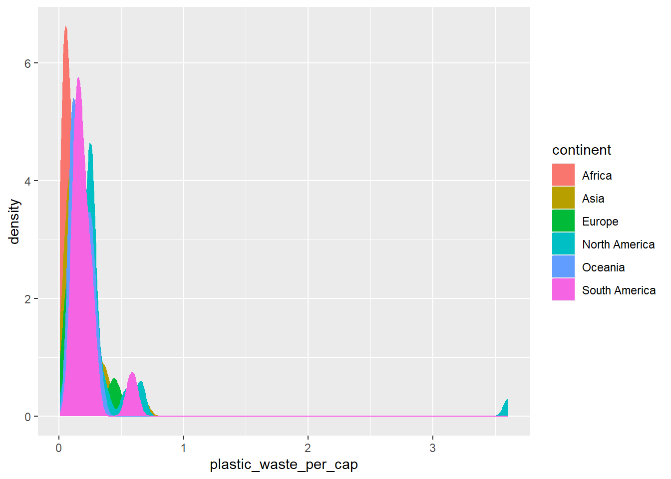
The overlapping colours make it difficult to tell what’s happening with the distributions in continents plotted first, and hence covered by continents plotted over them. We can change the transparency level of the fill color to help with this. The alpha argument takes values between 0 and 1: 0 is completely transparent and 1 is completely opaque. There is no way to tell what value will work best, so you just need to try a few.
ggplot(data = plastic_waste,
       mapping = aes(x = plastic_waste_per_cap,
                     color = continent,
                     fill = continent)) +
  geom_density(alpha = 0.7)
Warning: Removed 51 rows containing non-finite outside the scale range
(`stat_density()`).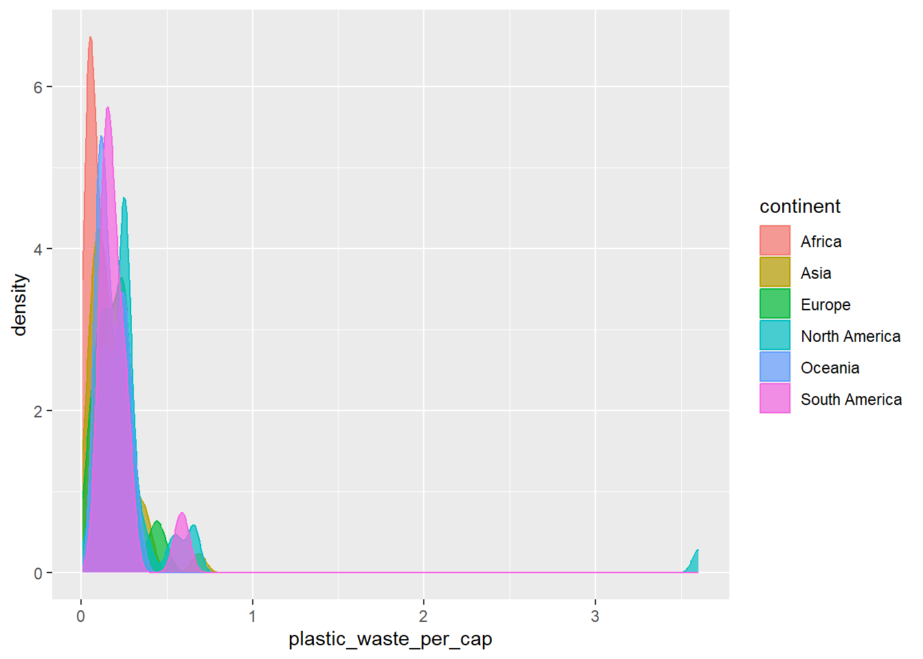
This still doesn’t look great…
- Recreate the density plots above using a different (lower) alpha level that works better for displaying the density curves for all continents.
- Describe why we defined the
colorandfillof the curves by mapping aesthetics of the plot but we defined thealphalevel as a characteristic of the plotting geom.
And yet another way to visualize this relationship is using side-by-side box plots.
ggplot(data = plastic_waste,
       mapping = aes(x = continent,
                     y = plastic_waste_per_cap)) +
  geom_boxplot()
Warning: Removed 51 rows containing non-finite outside the scale range
(`stat_boxplot()`).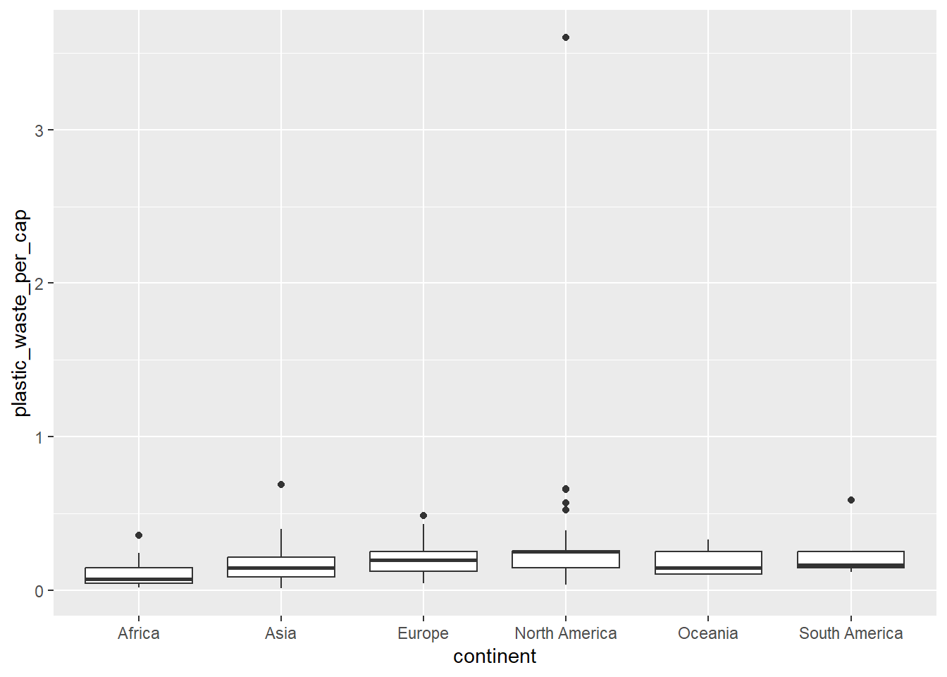
- Convert your side-by-side box plots from the previous task to violin plots.
- What do the violin plots reveal that box plots do not? What features are apparent in the box plots but not in the violin plots?
Do it on your own
**Remember:** We use `geom_point()` to make scatterplots- Visualize the relationship between plastic waste per capita and mismanaged plastic waste per capita using a scatterplot.
- Describe the relationship.
- Color the points in the scatterplot by continent.
- Does there seem to be any clear distinctions between continents with respect to how plastic waste per capita and mismanaged plastic waste per capita are associated?
- Visualize the relationship between plastic waste per capita and total population as well as plastic waste per capita and coastal population. You will need to make two separate plots.
- Do either of these pairs of variables appear to be more strongly linearly associated?
- Recreate the plot pictured below. (HINT: The x-axis is a calculated variable. One country with plastic waste per capita over 3kg/day has been filtered out. And the data are not only represented with points on the plot but also a smooth curve. The “smooth” should help you pick which geom to use.)
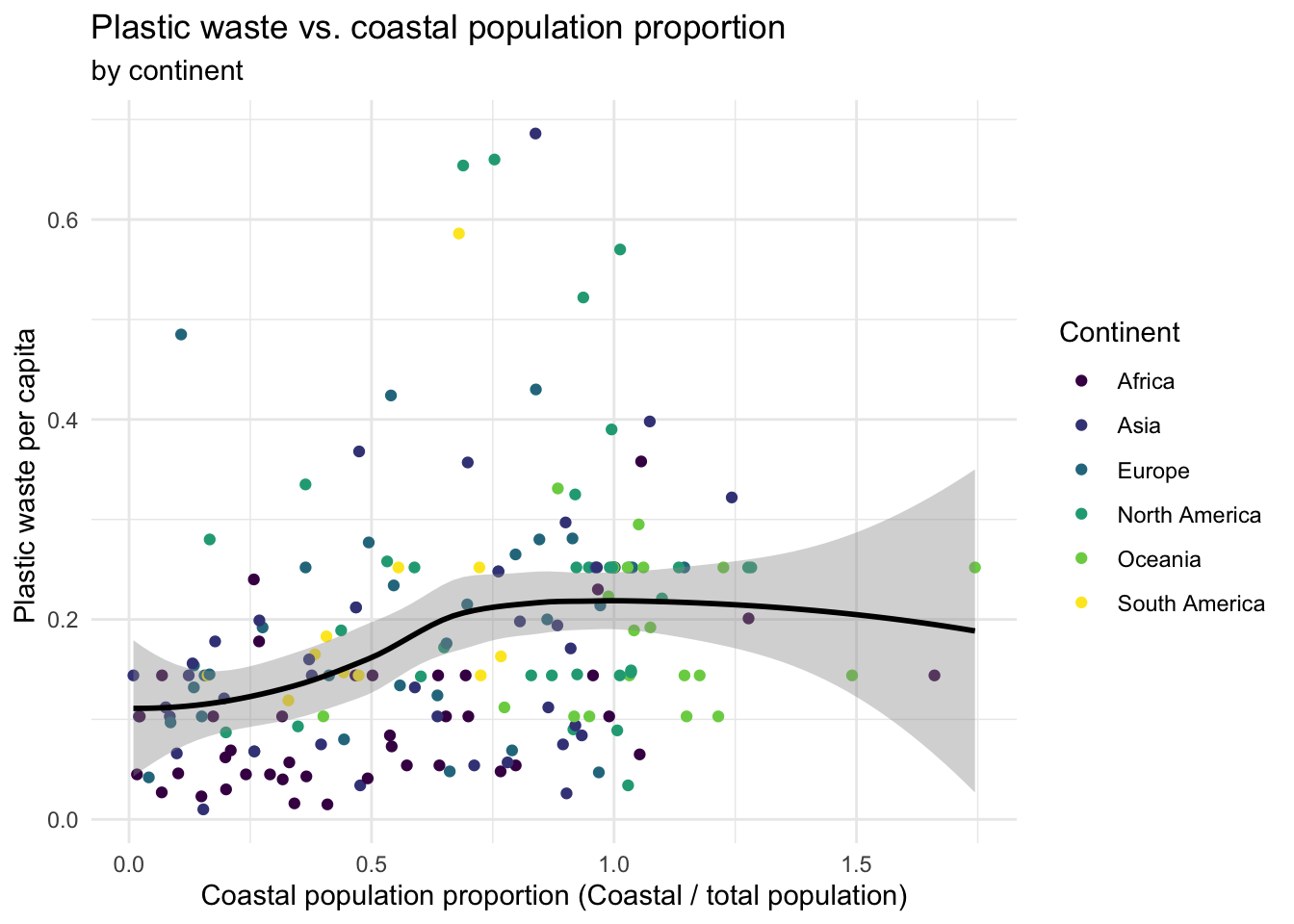
- Write an interpretation of what you see in context of the data.