knitr::opts_chunk$set(echo = TRUE)

library(dplyr) #package with useful data manipulation functions
library(ggplot2) #package allowing us to make plots
library(palmerpenguins) #package containing our dataWeek 3: Data Visualization Part 1
In this tutorial, we will introduce some reasons why data visualization is a critical aspect of data science and demonstrate the basics of creating effective data visualizations in R using ggplot2.
A COUPLE IMPORTANT NOTES:
Click “Run Code”
You will receive some warning outputs in this tutorial related to NAs in the data set. Don’t worry about that for right now.
The code chunk below sets up our coding environment. You will see I use the library() function to call packages. Packages are add ons you can load into R that include specialized functions. For example, ggplot2 is a package with functions that give us a lot of flexibility in creating data visualizations.
Why is data visualization important?
When we consider the data science workflow (Fig. 1), there is not a step that explicitly says “data visualization”. This is because data visualization is so essential that it occurs throughout the entire process!
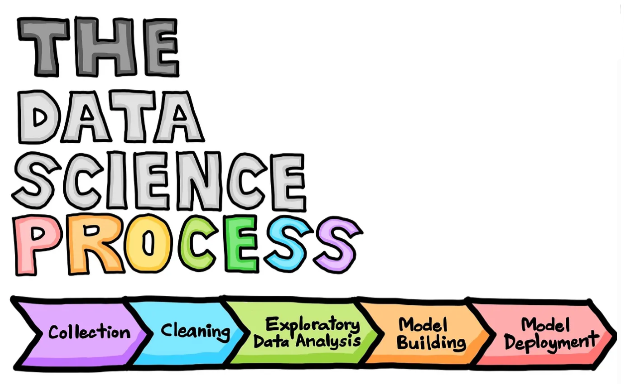
Figure 1. Data science life cycle. (Drawn by Chanin Nantasenamat in collaboration with Ken Jee; Source Article)
At its core, data visualization is used to simplify complex data. Data scientists often work with very large data sets (think millions of rows) and it is exceedingly difficult to conceptualize those data when interacting with them in table form. Using data visualization techniques, data scientists are able to:
- identify (sometimes unexpected) patterns and trends in data
- identify errors or weirdnesses in data
- establish expectations for relationships in data to inform understanding of analysis results
- communicate the results of their efforts to others
Your first step is ALWAYS to visualize your data!
Data visualization in R
There are a number of different tools that can aid in visualizing data in the R environment. Below is a selection of some of the tools available.
- ggplot2: A powerful and flexible plotting package based on the grammar of graphics, allowing for the creation of complex multi-layered plots with consistent syntax.
- base R: The default plotting system in R, offering simple and straightforward functions for plotting with basic customization options. (I often use base R plots for quick exploratory visualizations).
- plotly: An interactive graphing package that builds on ggplot2, allowing users to create dynamic, web-based interactive visualizations. For example, you can have a plot display a written value when hovering over a data point.
- shiny: A web application framework for R that allows users to create interactive web apps with reactive elements, including dynamic and responsive plots. This is a common tool for creating interactive data dashboards in R.
You are encouraged to explore these tools and others, but for the purposes of this lab, we will be focusing on ggplot2. You can find additional information on the ggplot2 package here.
Our data set: Palmer Penguins
The Palmer Penguins dataset includes morphometric information on three different species of penguins across three different islands in Antarctica monitored by the Palmer Station Long Term Ecological Research study area. These data were made available by Dr. Kristen Gorman and were originally published in:
Gorman KB, Williams TD, Fraser WR (2014). Ecological sexual dimorphism and environmental variability within a community of Antarctic penguins (genus Pygoscelis). PLoS ONE 9(3):e90081. https://doi.org/10.1371/journal.pone.0090081
Meet the penguins!
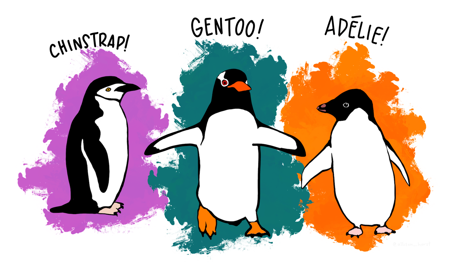
Figure 2. Palmer penguin species (artwork by @allison_horst).
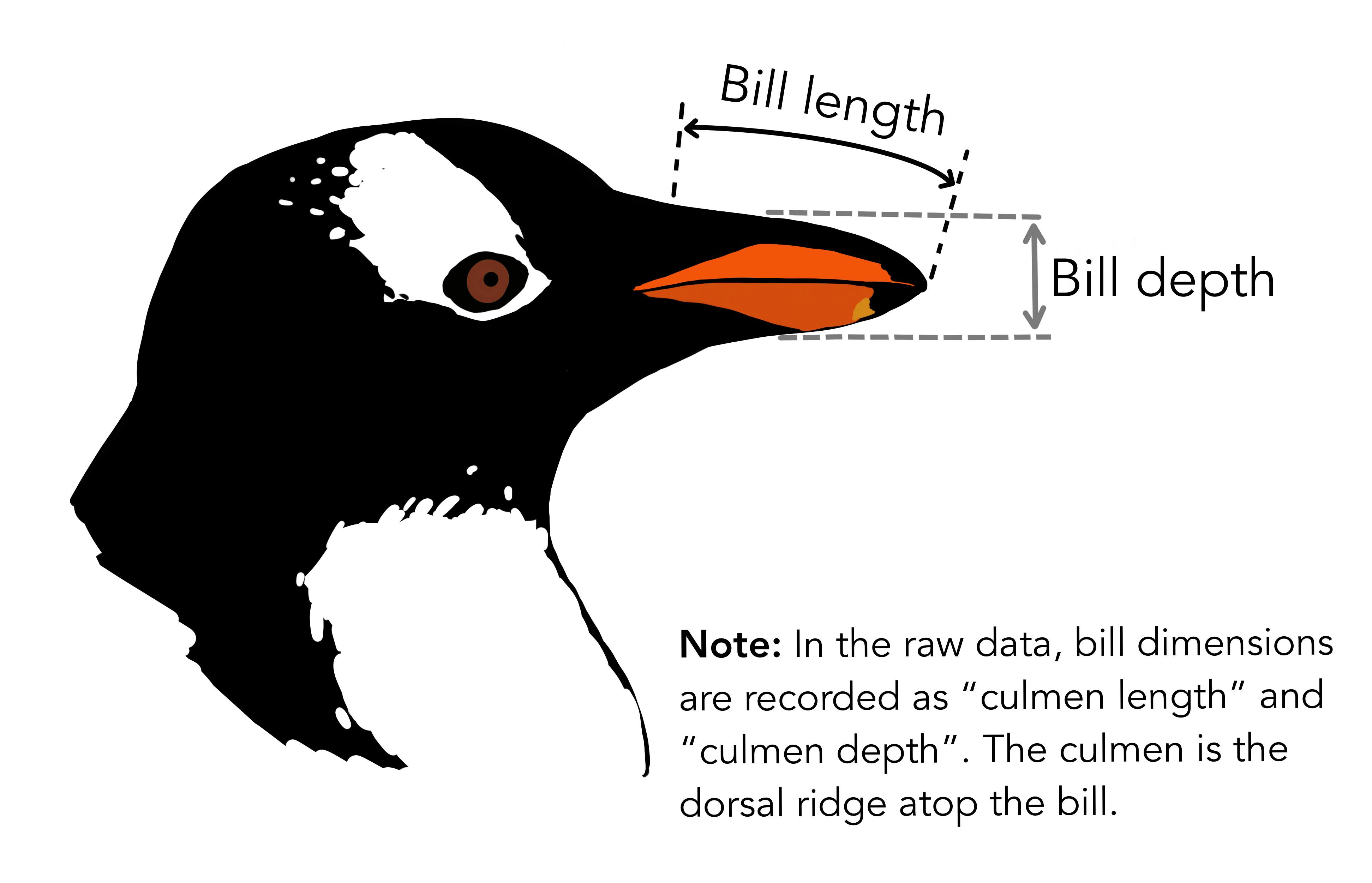
Figure 3. Depiction of morphometric bill measurements (artwork by @allison_horst).
Run the code chunk below to load the data.
Add another line of code to the chunk that will output a list of all your columns, what types of variables exist in those columns, and a couple observations from each column. The necessary function was mentioned in the IDS- Data and visualisation video (around the 2 minute mark). Screenshot your code and output for your HW submission.
You can see that there are a number of measurements in our data set, including the bill measurements, flipper length, body mass, sex, and year.
However, looking at the data this way, we can’t really discern patterns that might exist. For example, which of the penguin species is the smallest by weight? Do all the species show differences in their body morphometrics with sex? Is there one island that seems to have larger penguins than another?
By visualizing the data we can find answers to these questions and more!
Let’s visualize some data!
In this section we will demonstrate how to make a visualization using ggplot2.
For this first example, each line of code includes a comment (denoted by #) that describes what that line is doing. In general, it’s good practice to go line by line in code you receive to ensure you fully understand what it’s doing.
In the exercise code chunks, you will be required to fill in the missing code (denoted by #FILLMEIN) to create the visualization.
Demonstration:
We are going to start by making a plot that will show us the relationship between flipper length and body mass by species. Spend some time looking at the code and consider what you think the resulting plot will look like before running the chunk below.
Does the resulting plot match what you expected the code to generate?
EXERCISE 1:
Adjust the code chunk below to create a plot that shows the relationship between bill length and body mass by species. Screenshot your code and resulting plot for your homework submission.
(HINT: You might want to refer back to your column names to ensure you are inputting the right variable names, and don’t forget about commas!)
ANALYSIS INTERLUDE:
Based on your plots, do you think flipper length or bill length is better at predicting body mass? Which species do you think is the largest on average?
More ggplot2 use cases
Run the code chunks in this section to see how visualizations can help us get answers to research questions related to the penguins data set.
Research Question: What is the distribution of bill depth measurements?
We can use a histogram to plot distributions of numerical variables. Notice we only need to provide an x variable, as the histogram by default will plot the count of observations on the y axis.
We see a roughly bi-modal distribution of bill lengths across the entire data set, with peaks around 38-42 mm and 45-50 mm.
Research Question: How does the body mass of penguins differ across islands?
We can use a box plot or violin plot to look for differences across categorical variables.
Both of these plots show us that Biscoe Island has penguins with higher body mass on average.
Research Question: Is the relative distribution of bill length and flipper length across species conserved across both variables?
We can layer multiple geoms to get more insight into our data, as seen below. Notice we are also adding an argument for “color” in the aes() to specify we want our geom elements to be colored based on species.
We see that flipper length is consistently highest for Gentoo penguins, but the highest bill lengths are shared by Gentoo and Chinstrap penguins. Adelie penguins are consistently smallest for both morphometrics.
FINAL EXERCISE: Your turn!
Create three visualizations addressing the following research questions:
- Which island has the most Gentoo penguins?
- Do males have larger body mass on average than females?
- Is the relative distribution of bill length and bill depth of species conserved across both variables?
To receive full points for this exercise, you should provide a written answer to the each of research questions based on your visualizations. Screen shot the plot and the written answer and include it in your HW submission.
HINT: You might need to explore some other geom options.
Research Question: Which island has the most Gentoo penguins? (You might consider a bar plot…)
Research Question: Do males have larger body mass on average than females?
Research Question: Is the relative distribution of bill length and bill depth of species conserved across both variables?
Citations And Helpful Links
This lab was created University of the Virgin Islands Data Science program using ideas, information, and inspiration from the following sources:
Questions about implementing this tutorial? Contact Kayla Blincow at kaylamblincow@gmail.com.