URISE Workshop: Data Analysis
In this tutorial, we will be walking through how to use Linear Discriminant Analysis to predict whether towns are at high risk of an outbreak of swine flu (H1N1). NOTE: These are not real data on H1N1.
Make sure to click “Run Code” in all the interactive code chunks to make sure this tutorial will work.
Some early set up for our data (aka data manipulation steps). Don’t worry about this code, just run the chunk.
What is Machine Learning Classification?
Machine learning, in terms of classification, refers to a type of supervised learning where the algorithm learns to categorize data into predefined classes or labels. The goal of a classification model is to predict the class or category of new, unseen data based on patterns learned from a labeled dataset during training.
This has valuable applications in many fields, including health fields where it is used to:
- generate personalized treatment plans
- predict side effects
- have computers visually identify cancerous tumors
- identify at-risk populations
- predict the spread of disease
Linear Discriminant Analysis (LDA)
Linear Discriminant Analysis (LDA) is a popular technique used in machine learning for classification and dimensionality reduction when working with linearly separable variables. LDA is primarily used to classify data into groups by finding a linear combination of variables that best separates the groups. It projects the data onto a lower-dimensional space where separation between classes is maximized.
Our scenario: H1N1 Swine Flu
Swine influenza is a respiratory disease of pigs caused by type A influenza viruses. In the 2009-10 flu season, a new H1N1 virus began causing illness in humans. It resulted in a pandemic that caused an estimated 284,400 deaths worldwide.
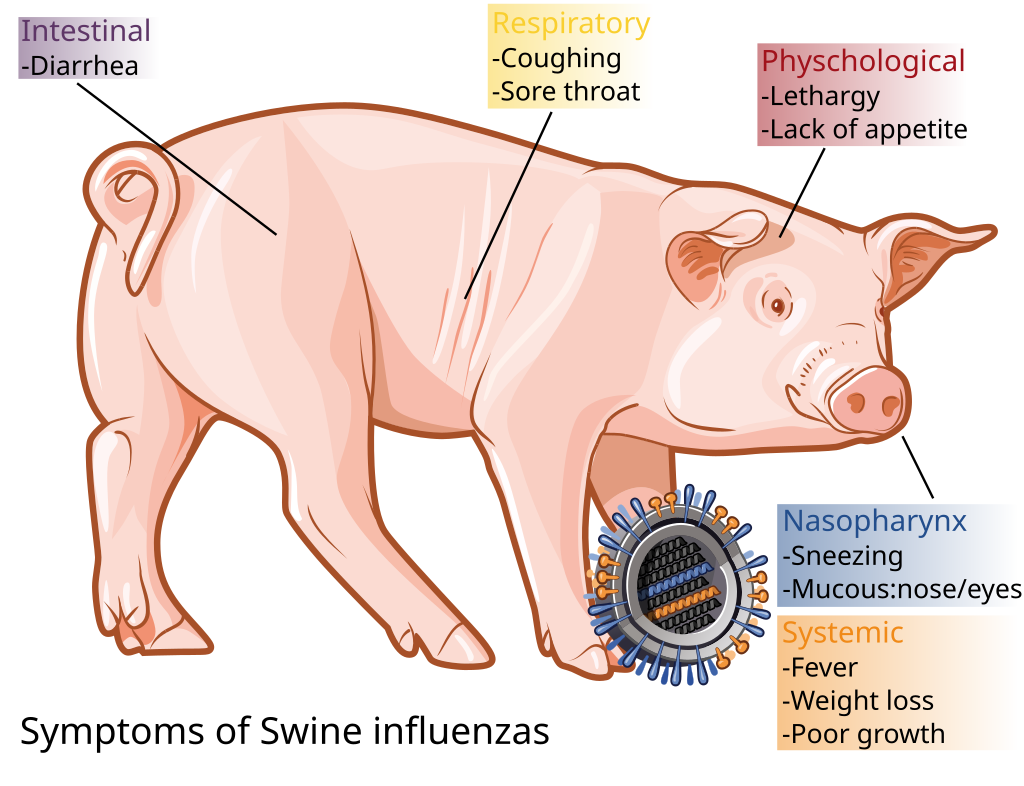
Figure 1. Symptoms of Swine Flu (Wikipedia)
2024-2025 Season Outbreak
For the purposes of this exercise, we are going to imagine that the 2024-2025 flu season has also seen an outbreak of H1N1 that can infect humans. Epidemiologists would like to notify towns that are at risk of experiencing severe outbreaks to be extra cautious, but first they need to identify which towns are at high risk. They have gathered a data set of towns that have already experienced outbreaks (H1N1_known). The data set includes a measure of the severity level of the outbreak (high, mid, or low) and measures of four variables that likely influence outbreak severity.
The variables they measured are:
Vaccination_Availability: this is a scaled measure of the availability of flu vaccinations in each town. Generally, towns with lower availability of vaccinations will be at higher risk of flu outbreaks.
Travel_Metric: this is a scaled measure of the amount of travel in and out of the town. Generally, towns that have a lot of folks coming and going are more likely to get exposed to new viruses.
Dist_Nearest_Outbreak: this is a scaled measure of how far the town is from the nearest outbreak of H1N1. Towns in closer proximity to other towns that have already had an outbreak are generally at higher risk of experiencing a severe outbreak.
Medical_Awareness_Metric: this is a scaled measure of the culture around medical awareness and safety in the town. Generally towns with a higher value of this metric will be more aware of common flu avoidance measures, such as frequent hand washing, staying home when feeling under the weather, etc.
Step 1: Take a look at our data
Run the code chunk below to take a quick look at our data of known towns with outbreaks:
You can see that we have a column for each of our four variables, which are all numeric variables (<dbl>), and one column for the severity of the outbreak which is a categorical variable (<fct>).
Run the code chunk below to print a few plots of our known data (NOTE: the final line of this code works because of my favorite package - patchwork - it’s amazing for making multi-panel plots):
We can see some basic trends in the data, but it would be hard to classify new towns based on looking at any of these metrics in isolation. They all have some overlap. Using LDA, we can classify towns using all the variables at once and do a better job predicting which towns are at high risk of a severe outbreak.
Step 2: Run the LDA
We will use the lda() function in the MASS package to fit the LDA model to our known data (or training data):
Here is how to interpret the output of the model:
Prior probabilities of group: These represent the proportions of each outbreak severity level group in the training set. For example, 30.8% of all towns in the training set had high severity outbreaks.
Group means: These display the mean values for each predictor variable for each severity level.
Coefficients of linear discriminants: These display the linear combination of predictor variables that are used to form the decision rule of the LDA model. For example:
LD1: - 0.609*Vaccination_Availability - 0.627*Travel_Metric + 3.560*Dist_Nearest_Outbreak + 2.144*Medical_Awareness_Metric
LD2: .743*Vaccination_Availability + .754*Travel_Metric – 3.223*Dist_Nearest_Outbreak + 2.944*Medical_Awareness_Metric
Proportion of trace: These display the percentage separation achieved by each linear discriminant function.
Step 3: Plot training data LDA
The code below generates a two-dimensional plot with our linear discriminants as the x and y axes. This is essentially a two-dimensional representation of our four-dimensional data (four predictor variables) that shows how the LDA clustered our observations of towns based on the severity of H1N1 outbreaks.
We can see from this plot that the high severity outbreak towns separate distinctly from the low and mid-level severity outbreak towns. This suggests that we are probably going to do a pretty good job predicting high severity outbreak areas, but might have a harder time distinguishing between low and mid-level severity areas.
Let’s see what happens when we try to predict the level of severity of outbreaks expected for new towns…
Step 4: Use the LDA model to make predictions
In addition to our known data set, we also have a data set of towns that have not yet experienced an outbreak (H1N1_unknown). We would like to predict the severity of a potential H1N1 outbreak in these unknown towns based on our predictor variables: availability of vaccines, travel metric, distance to the nearest outbreak, and medical awareness metric.
We use the predict() function to do this. NOTE: This is a really handy function. It basically allows you to use (almost) any statistical model and predict across new values.
This returns a list with three variables:
class: The predicted severity group
posterior: The posterior probability that an observation belongs to each severity group
x: The linear discriminants
We can quickly view each of these results for the first six observations in our test dataset:
So we have used our LDA to make predictions. The above functions are useful, but this is a case where it is easier to understand what happened by using a visualization.
Step 5: Visualize the results
Let’s plot our LDA again, but this time let’s see where our new unknown towns landed compared to the towns we did know.
The darker triangles show us the predicted severity of outbreaks for the unknown towns, and where they fall in this two-dimensional depiction of all of our variables compared to the known towns.
Step 6: Check our model
As the flu season progresses, we monitor the unknown towns to see if they have H1N1 outbreaks and then record the severity of the outbreak once it occurs. By collecting these data and getting the “true” answer, we can check to see how accurate our model was a predicting the severity of outbreaks.
We actually already have this information stored in our H1N1_unknown data file, and we can test to see how accurate our model was using the code below:
93.5% of the time we accurately predicted the level of severity of an H1N1 outbreak for new towns. That’s pretty good!
What are some things we could do to improve the accuracy of our model?
Hopefully you can see how this type of analysis might be useful in the real world for informing health science outcomes, but also many, many other fields.
References
Much of this tutorial was pulled from: Linear Discriminant Analysis in R (Step-by-Step) (statology.org)
Questions about implementing this tutorial? Contact Kayla Blincow at kaylamblincow@gmail.com.