URISE Workshop: Data Visualization
In this tutorial, we will introduce some reasons why data visualization is a critical aspect of data science and demonstrate the basics of creating effective data visualizations in R using ggplot2.
Make sure to click “Run Code” in the interactive code chunks.
Why is data visualization important?
When we consider the data science workflow (Fig. 1), there is not a step that explicitly says “data visualization”. This is because data visualization is so essential that it occurs throughout the entire process!
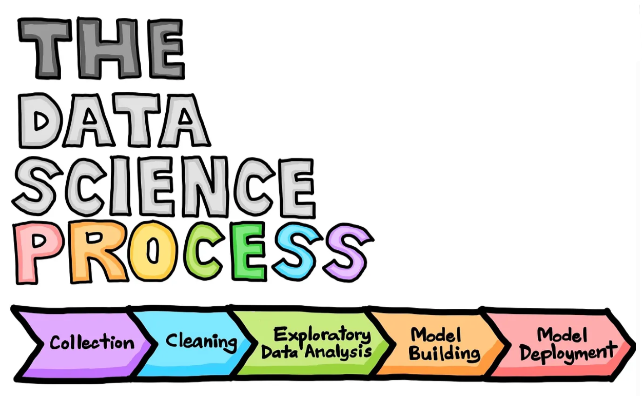
Figure 1. Data science life cycle. (Drawn by Chanin Nantasenamat in collaboration with Ken Jee; Source Article)
At its core, data visualization is used to simplify complex data. Data scientists often work with very large data sets (think millions of rows) and it is exceedingly difficult to conceptualize those data when interacting with them in table form. Using data visualization techniques, data scientists are able to:
- identify (sometimes unexpected) patterns and trends in data
- identify errors or weirdnesses in data
- establish expectations for relationships in data to inform understanding of analysis results
- communicate the results of their efforts to others
Your first step is ALWAYS to visualize your data!
Data visualization in R
There are a number of different tools that can aid in visualizing data in the R environment. Below is a selection of some of the tools available.
- ggplot2: A powerful and flexible plotting package based on the grammar of graphics, allowing for the creation of complex multi-layered plots with consistent syntax.
- base R: The default plotting system in R, offering simple and straightforward functions for plotting with basic customization options. (I often use base R plots for quick exploratory visualizations).
- plotly: An interactive graphing package that builds on ggplot2, allowing users to create dynamic, web-based interactive visualizations. For example, you can have a plot display a written value when hovering over a data point.
- shiny: A web application framework for R that allows users to create interactive web apps with reactive elements, including dynamic and responsive plots. This is a common tool for creating interactive data dashboards in R.
You are encouraged to explore these tools and others, but for the purposes of this lab, we will be focusing on ggplot2. You can find additional information on the ggplot2 package here.
Our data set: James Lind’s scurvy study
Scurvy was a common affliction among sailors in the 1700s. James Lind’s scurvy data set includes information on the severity of symptoms of twelve scurvy patients after being treated with one of the following remedies: cider, dilute sulfuric acide, sea water, vinegar, citrus, and purgative mixture. These data are included in the medicaldata package in R and were originally published in James Lind’s A Treatise on the Scurvy in Three Parts in 1757.
Arrrr, Ye Got Scurvy Mate?


Run the code chunk below to load the data and take a quick look at it.
You can see the data includes information on the patient id (study_id), treatment, dosing regimen, severity of symptoms, and whether the sailors were fit for duty after treatment.
However, looking at the data this way, we can’t really discern patterns that might exist. For example, which treatment seemed to reduce the severity of symptoms? Which treatment was associated with the lowest severity of gum rot overall?
By visualizing the data we can find answers to these questions and more!
Let’s visualize some data!
In this section we will demonstrate how to make a visualization using ggplot2.
For this first example, each line of code includes a comment (denoted by #) that describes what that line is doing. In general, it’s good practice to go line by line in code you receive to ensure you fully understand what it’s doing.
In the exercise code chunks, you will be required to fill in the missing code (denoted by #FILLMEIN) to create the visualization.
Demonstration:
We are going to start by making a plot that will show us the number of patients associated with each level of symptom severity for gum rot colored by treatment type. Spend some time looking at the code and consider what you think the resulting plot will look like before running the chunk below.
Does the resulting plot match what you expected the code to generate?
EXERCISE 1:
Adjust the code chunk below to create a plot that will show us the number of patients associated with each level of symptom severity for skin sores colored by treatment type.
(HINT: You might want to refer back to your column names to ensure you are inputting the right variable names, and don’t forget about commas!)
ANALYSIS INTERLUDE:
Based on your plots, were there more patients with sever gum rot or skin sores? Which treatment do you think is the best so far?
Asking more scurvy questions
Run the code chunks in this section to see how visualizations can help us get answers to research questions related to the scurvy data set.
Research Question: Which symptom had the most severe cases?
To answer this question it will help us if our data is in long format. This will allow us to have a single column for symptom, rather than each symptom having it’s own column. Take a look at the output from the code chunk below and notice the changes to the data set.
You can see now all our symptom columns have been collapsed into a single column “symptom”. This also means that our study_id, treatment, and dosing_regimen_for_scurvy columns have repeated rows for each unique symptom value.
Having the data formatted this way makes it easier to make visualizations comparing symptoms.
Based on this figure, we can see that lassitude had the highest number of severe cases, followed by skin sores and weakness of the knees.
EXERCISE 2:
Adjust the code chunk below to create a plot that will show us which treatment type seemed to perform the best for reducing severity of scurvy symptoms.
(HINT: You might want to refer back to your column names to ensure you are inputting the right variable names, and don’t forget about commas!)
Which treatment works best for treating scurvy?
Adding continuous variables
The data set we have been working with thus far have consisted solely of categorical data (e.g. Severity (none, mile, moderate, severe). This means that we are limited to looking at the number of observations in each category, chiefly with bar plots. Numerical or continuous data consists of continuous number values and opens up new possibilities for data visualization.
We are going to use a made up data set to explore how we visualize continuous data. These data will consist of observations of incidences of scurvy among ship crews. They will include data on the weight, height, and age of each sailor, whether they contracted scurvy or not, which ship they sailed on, and the year the ship was active.
Run the code chunk below to generate the new data set (don’t worry if you don’t follow what the code is doing, we just need the data).
Now that we have the data you can take a quick look at it
Notice that weight, height, and age are all numeric values. Also scurvy incidence is coded as N for no scurvy or Y for yes scurvy.
Research Question: How does the weight of sailors differ across ships?
We can use a box plot or violin plot to look for differences in a continuous variable (weight) across categorical variables (ship).
Both of these plots show us that the Sea Serpent had the heaviest sailors.
Research Question: What is the relationship between height and weight?
We can use a scatterplot to look at the relationship of two continuous variables against each other.
Unsurprisingly, we see that weight generally increases with height.
Research Question: Does the relationship between height and weight differ across ships?
We can use color to show whether continuous relationships differ across a categorical variable.
It doesn’t look like there is much a difference in the trend between ships, but the Sea Serpent tends to have shorter sailors for a given weight value than the other ships.
FINAL EXERCISE: Your turn!
Create three visualizations addressing the following research questions:
Does the incidence of scurvy seem to be related to height?
Does the incidence of scurvy seem to be related to age?
Which ship had the highest incidence of scurvy? Can you think of an explanation for your answer? (HINT: think of when James Lind’s publication was released)
Research Question: Does the incidence of scurvy seem to be related to height?
Research Question: Does the incidence of scurvy seem to be related to age?
Research Question: Which ship had the highest incidence of scurvy? Can you think of an explanation for your answer? (HINT: think of when James Lind’s publication was released)
Questions about implementing this tutorial? Contact Kayla Blincow at kaylamblincow@gmail.com.